
04 Identity
Intro
Reaktor Brand Guidelines - an essential resource for maintaining the visual identity that defines us. Our brand is more than just a logo; it reflects the unique blend of rigor and expressiveness that sets us apart. This guide ensures that every visual element resonates with our story and values, embodying our commitment to excellence and innovation.
Whether designing marketing materials, crafting presentations, or shaping our brand's online presence, these guidelines will help you maintain a cohesive and compelling Reaktor identity.
Logo
Overview
Though the Reaktor brand consists of many parts and pieces, our logo is the key focal point— an instantly recognizable signature of the brand. For this reason, it is important to use the logo exactly as specified in these guidelines. Doing so will ensure it always looks its best.
Our logo has two applications: full wordmark and the R symbol. Our wordmark is a modified version of our brand typeface Scto Grotesk A and acts as a reliable anchor to various brand expressions. Our R symbol is a dynamic, own-able shorthand for the brand and can be used in more expressive ways as outlined in these guidelines. Both applications can be used alone or alongside other applications.
Clearspace ensures legibility and impact of the logo by isolating it from competing visual elements, such as supporting copy and/or additional graphics.
The clearspace should be considered the absolute minimum safe distance and is defined by X.
Sizing
Establishing a maximum and minimum logo size ensures the impact and legibility of the logo is never compromised.
Maximum Size
Our logo can be scaled to suit any application in both print and digital communications.
Minimum Size
For the wordmark, the minimum recommended size is 12px tall in digital, or .15" in print.
For the R symbol, the minimum recommended size is 24px tall in digital, or .2" in print.
Positioning
When using the wordmark and R symbol, there are a few principles to follow:
Wordmark
The wordmark symbol should always be placed in either the top or bottom left hand corner.
R symbol
The R symbol is a bit more versatile concerning placement. Position it centrally or in the top and bottom left and right corners.
Sub-brands
Our sub-branding system is designed to create a clear hierarchy and maintain a balanced relationship between the parent brand and the sub-brands.
Our sub-brands should always be typeset in Scto Grotesk A using sentence case. With 'x' as the width of the 'R' in the wordmark, use a blank space of 1/4x to the right of the logo to separate the addition.
Motion
We have a number of animated R symbols that can be used for brand videos, social media, and presentations. They have been designed for versatility and brand consistency.


Don'ts
To ensure the integrity and legibility of our identity, never alter or modify the Reaktor logo in anyway.
Its orientation, color, and composition should remain as indicated in this document, with no exceptions.
Color
Brand-led
Our palette was designed to create bold assets that uniquely represent the Reaktor duality of rigor and expression.
Yellow
Our primary brand color, yellow, symbolizes Reaktorians' optimism, creativity, and proactive spirit. It effectively captures attention, serving well as a background or call-to-action color, especially in contexts requiring expression or heightened focus.
Black & White
Black and white is bold and straight-forward. It provides clear, no fuss and easy-to-understand information, reserved for headlines, body text and backgrounds.
Grey
Grey is our neutral supporting color, ideal for backgrounds, secondary information like metadata, bylines, and footnotes. It also adds an extra layer of hierarchy when necessary.
RGB: 0, 0, 0
CMYK: 0, 0, 0, 100
PANTONE: Process Black C
RGB: 191, 191, 191
CMYK: 0, 0, 0, 25
PANTONE: Cool Gray 4 C
RGB: 255, 255, 255
CMYK: 0, 0, 0, 0
PANTONE: P 179-1 C
RGB: 231, 254, 77
CMYK: 10, 0, 86, 0
PANTONE: 387 C
Tints
For improved definition, the Reaktor color palette includes controlled use of tints in 10% increments, between 5% and 95%.
The use of tints adds depth and provides a creative tool for extending the range of the color palettes when needed.
Note: Tints are typically reserved for infographics, illustrations and additional levels of hierarchy, only. However, for Shape & Texture patterns on black backgrounds, we also utilize #737373 as the pattern color.
Pairing
Color pairing
The colors to the right may be used as background colors in our brand system. Choose the logo colorway that creates maximum contrast, as illustrated here.
Logo pairing
When pairing our logo with our brand colors, follow these colorways. The logo is always set in black or white to ensure reconigzability and contrast.
Type pairing
When pairing our type with our brand colors, follow these color-ways. Similar to our logo color-ways, it’s crucial that there is enough contrast between the type and background color to ensure accessibility.
Headlines and body text are always set in black or white. Use these combinations, which pass WCAG AA contrast standards for both large and small text.
Don'ts
To establish consistency and recognizability within our visual identity, it's crucial to avoid certain practices when utilizing the core palette.
Content-led
Since Reaktor provides support and work to many businesses and industries, we need a way to bring those partnerships to the forefront.
When a client relationship takes centre stage, for example, in pitches or in cases studies only, we adjust our "house style" to accommodate. We maintain our base colors of black, white and grey for text, but we substitute our primary brand color, yellow, for the client's primary color. Alternatively, you can select a dominant color/palette from the content provided.


Typography
Typefaces
Brand Typefaces
Larken is our primary display typeface, and is used for display and headline moments— particularly for marketing and external-facing materials. We use Larken Thin as the primary weight of this typeface.
Scto Grotesk A is our secondary typeface, used primarily for body copy and all other uses, including more functional information. We use in Light & Medium, and their corresponding italics.
Alternative Typefaces
Source Serif 4 Regular (or Normal) and Work Sans are the closest alternatives to our brand typefaces, available for free and in Google Workspace. They should be only be used as alternatives in Google Workspace, or by those who may not have access to our brand typography.
Display & Headlines
Larken Thin
Body Copy & Utility (Body, Sub-headers, Labels)
Scto Grotesk A Light
Scto Grotesk A Light Italic
Scto Grotesk A Medium
Scto Grotesk A Medium Italic
Scale
Our spacing scale provides an overview of all measurements used across our website, deck template, social media assets, and white papers.
Pixel
This is the sizing we use to define our scale in design tools such as Figma or Keynote.
Rems
Rems is a relative unit in CSS its size is based on the root element's font-size, 16px in our case, allowing for flexible and consistent typography and spacing scaling across web designs.
Tailwind
Tailwind CSS is a utility-first framework for rapidly building custom web interfaces using class-based styling and we have used this as the foundation of our website. Tailwind has its own system, so for ease of use, we have aligned those values alongside our Pixel and Rem scales.
Creating a new scale
If for any reason you need to create a new scale, it is important that you maintain the scale’s proportions, and letter-spacing and line-height settings. The following rule will help you calculate each value for your new pixel scale:
(New root pixel size) x (Rem value) = Value
16px x 4.5 rem = 72px
Note
Our spacing and typography scales are linked, and should be updated together.
Hierarchy
Labels
For larger scales, such as desktop, labels should be 1x the root font size to preserve balance and contrast. A -1% tracking set in all caps provides more legibility. Labels should be limited to a few words. For smaller scales, such as mobile, labels should be 0.875x the root font size.
Display & Headlines
Go big. Headlines should generally be at least 2x larger than body copy to preserve contrast and hierarchy.
Subheaders
The Scto subhead should be equal in size to body copy,- but in medium weight.
Body copy
Keep it legible. Body copy should be set in light and have an airy 130% leading for easy reading.
Alignment
Typography should only ever be aligned in two ways: Left-aligned or centered. Never right-align or force-justify typography.
Headlines
Headlines
Headlines
Headlines
Don'ts
To establish consistency and recognizability within our visual identity, it's crucial to avoid certain practices when setting typography.
Spacing
Scale
Our spacing scale provides an overview of all measurements used across our website, deck template, social media assets, and white papers.
Pixel
This is the sizing we use to define our scale in design tools such as Figma or Keynote.
Rems
Rems is a relative unit in CSS its size is based on the root element's font-size, 16px in our case, allowing for flexible and consistent typography and spacing scaling across web designs.
Tailwind
Tailwind CSS is a utility-first framework for rapidly building custom web interfaces using class-based styling and we have used this as the foundation of our website. Tailwind has its own system, so for ease of use, we have aligned those values alongside our Pixel and Rem scales.
Creating a new scale
If for any reason you need to create a new scale, it is important that you maintain the scale’s proportions, and letter-spacing and line-height settings. The following rule will help you calculate each value for your new pixel scale:
(New root pixel size) x (Rem value) = Value
16px x 4.5 rem = 72px
Note
Our spacing and typography scales are linked, and should be updated together.
Rhythm & Structure
To define a good vertical rhythm and structure:
1. Identify the most common body size
Start with your most frequently used body text size. For example, our chosen size is 24px with a line-height of 130%.
2. Determine the measurement
Measure the distance from the baseline of one line of text to the top of the lowercase letters on the next line.
In our example, this measurement is denoted with an 'X'.
3. Establish the closest value
From our measurements, the closest value we determined is 48px.
4. Determine spacing for solid elements, margins and gutters
When spacing solid elements, such as buttons or images use the closest value (48px) or its multiples. A suggested scale based on our example would be: 24px, 48px, 72px, 144px.
Adjust for typography
Note: The above scale works well for solid elements. However, when spacing typography or combining typography with solid shapes, you might need to adjust for the line-height of the text. In such cases, introduce spacings like 16px or 32px to visually maintain a consistent rhythm.
Layout
Principles
Our brand boasts of expertise and competence, and our graphic tools help us express that. The tools and guidelines we provide help maintain clear, confident compositions. Here are some key layout principles that are useful to achieving this.
Negative Space
There’s no need to crowd the page; negative space offers restraint and clarity.
Grid
A strong underlying grid gives structure and discipline to each composition. Depending on the sizing and format. All layouts should be divisible by 1, 2, 4, 8, 16 and so on.
Split
The split nods to the two sides of Reaktor: Rigor and expression. This shape can be used to hold illustration and photography. It can also be used to structure layouts or in animation and video transitions.
Right Angles
Straight edges and right angles speak to Reaktor’s rigor and precision.
In use
Compositions should be:
- Type and/or image-driven
- Maintain clear hierarchy
- Use straight edges and alignment
- Use ample negative space,
- Display strong use of the grid


Don'ts
To establish consistency and recognizability within our visual identity, it's crucial to avoid certain practices when utilizing xxx.
Split
The split nods to the two sides of Reaktor: IQ and EQ. This shape can be used to hold illustration and photography. It can also be used to structure layouts or in animation and video transitions.
When using the split there are few things that you need to consider:
- The top and bottom edges of the split should always be equal to the margin. This is marked with ‘X’ on the diagram.
- We have optically adjusted the split so that both the top and bottom edges align with grid, allowing for a more precise layout when used in combination with type. As marked with a dashed line.
Grids
Our Grid
Our grid is integral to consistently creating clean, clear applications.
We like to base our layouts off of a 16, 8 or 4 column grid depending on the sizing and format. All are divisible by 1, 2, 4, 8, 16 and so on, and allow for a wide range of possibilities and applications.
Large (16 columns)
Usually good for desktop devices or presentation decks. You have more room to play with and therefore more room for flexibility with the grid.
Medium (8 columns)
Great for narrower devices such as a tablets, social posts or A sizes.
Small (4 columns)
Best used on mobile devices.
Our margins and gutters should always be equal to one another. Margins and gutters can vary depending on format needs, but in general we like to lean towards more narrow. Narrow margins and gutters allows us to maximise the space and creates clean, tight compositions.
The following pages provide grids for our most common use cases.
Grid examples
Iconography
Icon set
Our icons have been selected specifically and adjusted to complement our typography.
We use and customised version of the Untitled UI Icons, vector line icons pack designed for digital applications. There are 1,100+ icons across 19 categories to choose from. The pack is regularly updated, providing us with the breadth of icons we need across the industries and topics we work with.
Icon grid
Our icons use a live stroke of 1.5px on a 24px grid. A 4px grid to ties in with our baseline grid. A 1.5px stroke ensures preserves balance with the weight of our typefaces. Since we use 1.5px stroke, the line does not sit on the grid perfectly.
Sizing & scaling
Our icons are set on a 4px grid, aligning with our baseline grid. The default icon size is (24px) with a stroke weight of 1.5px. Other possible icon sizes include: 16px, 24px, 32px, 48px, 72px, 96px, and 192px.
When scaling, ensure the icon size adjusts proportionately. This ensures that the icon's stroke widths match the character thickness of "Scto Grotesk A" at equivalent font sizes.
Don'ts
To establish consistency and recognizability within our visual identity, it's crucial to avoid certain practices when utilizing xxx.
Key messages
Visuals
Concept
At Reaktor, our unique strength lies in the fusion of creativity and rigor in our community. This duality blends structure with imagination, and humility with ambition, reflecting our internal spirit and external innovation.
Our brand embraces this duality — presenting a polished, professional face complemented by an expressive, creative one. This dual identity forms the bedrock of our brand.
Rigor & Expression: Written Representation
A harmonious blend of rigor and expression Reaktor. Rigor underpins our analytical prowess, systematic approach, and innovative drive, reflecting our dedication to excellence. Simultaneously, Expression captures the essence of our vibrant culture, underlining our creativity, empathy, and ability to adapt to context.
Rigor & Expression: Visual Representation
For the visual aspect of our brand language, we embrace a harmonious blend of rigor and expression that defines Reaktor.
The rigorous side of our visual identity is characterized by structured patterns and textures, meticulously crafted and computer-generated to signify our analytical prowess, systematic approach, and drive for innovation.
On the flip side, the expressive dimension of our identity is brought to life through hand-drawn illustrations. These illustrations feature lines that are more expressive and free, embodying the essence of our vibrant culture. They highlight our creativity, empathy, and adaptability, underscoring our ability to resonate with diverse contexts. Together, these elements fuse to form a cohesive visual language that is uniquely Reaktor, balancing precision with spontaneity.


Range of Expression
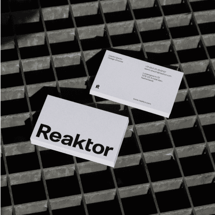
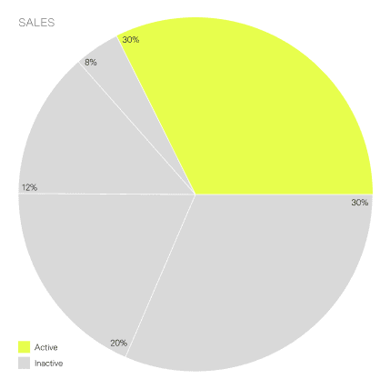
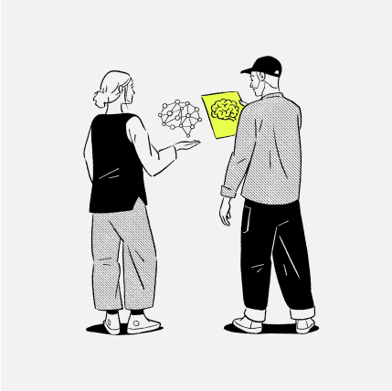
As a diverse and global organization serving a variety of industries, each with unique voices and requirements, we employ five key pillars: Foundation, Shape & Texture, Illustration, Photography, and Infographics.
Each pillar possesses its own distinct level of expression. No single element is more representative of Reaktor than another; rather, they collectively adapt to meet our organization's specific needs and tones.
This versatile approach ensures that we effectively cater to the diverse facets of our global operations.


Foundation Pillar
Our Foundation pillar stands as a symbol of stability, reliability and clarity, and harmoniously integrates with our other visual pillars. Foundation is versatile, it can stand alone, or be seamlessly blended to create a cohesive and harmonious visual representation of Reaktor's multifaceted identity.
Visual Pillars
Our visual pillars are instrumental in defining our organizational identity. They enable us to build brand recognition, engage audiences effectively, simplify complex concepts, and enrich our storytelling. Beyond our foundational pillar, we focus on four additional key pillars to enhance our visual language. These are:
- Shape & Texture
- Illustration
- Photography
Infographics
Each pillar plays a vital role in conveying our message and connecting with our diverse audience.
Foundation
Our Foundation pillar stands as a symbol of stability, reliability and clarity, and harmoniously integrates with our other visual pillars. Foundation is versatile, it can stand alone, or be seamlessly blended to create a cohesive and harmonious visual representation of Reaktor's multifaceted identity.
Key Attributes
- Precise type & clear hierarchy
- Clear messaging
- Focused accetns
Structured layouts & ample white space
Split
- Foundation is suited for moments that require clarity and a grounded approach.
- It can be used for corporate communications, annual reports, and any other official documents where a sense of formality and dependability is required.
- The simplicity and structure make it an excellent choice for educational and training materials, where conveying information in a straightforward and accessible manner is key.
- The understated nature is suitable for platforms where a subtle, unobtrusive design is required, allowing the content to take centre stage.
Shape & Texture Overview
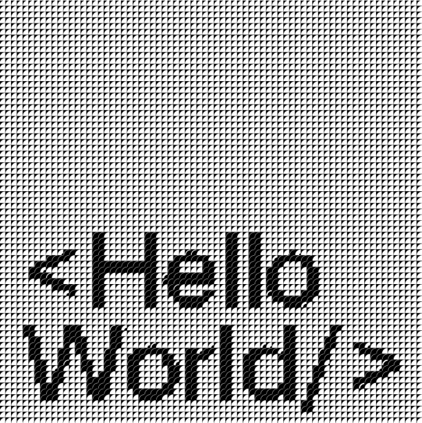
The Shape & Texture pillar is a fundamental representation of Reaktor's ethos. It encapsulates our commitment to rigor, structure, and innovation. This aspect of our visual language vividly mirrors the spirit of transformation that is inherent in our brand.
This pillar symbolizes the process of deconstruction and re-emergence, stronger and more resilient.
Its adaptable nature effectively accommodates the complexity of Reaktor's diverse tones and needs. This makes it a versatile and essential tool in our visual arsenal.


Shape
Our monogram, at its core, embodies the Reaktor spirit of transformation. It hints at the process of breaking down only to re-emerge stronger. This reflects our mission: guiding clients to pinpoint challenges, enabling them to disassemble existing structures and rebuild even more robust, future-ready foundations.
Our monogram's division into three primary segments visually manifests this ethos. Such modularity allows these elements to be imaginatively reshaped in bold geometric patterns for use across our branded materials.
Usage
- This treatment is ideal for any content or platform where the narrative revolves around change, evolution, or breaking down to rebuild stronger.
- The modular patterns derived from the monogram are versatile, making them apt for various mediums such as posters, merchandise, articles and white papers.
Suitable for materials related to consulting, problem-solving, or rebranding.
Tonal Range
To create a tonal range do the following:
1. Frame Setting
- Establish a 1:1 frame size.
Adhere to our 4px baseline grid. For instance, opt for a 64 x 64px.
2. Shape, Scale, and Cropping
- Choose one of the predefined 3 shapes.
You have the liberty to crop and scale for added dynamism and interest. However, it should still hint at its original form.
3. Tonal Range Definition
- Aim for about 8 tonal variations of your chosen shape.
- Square 1: This should prominently feature your shape in its thickest form, acting as your 'black.'
- Square 8: Represent this as 'white.' The shape here should be at its thinnest or might even be left blank.
Squares 2 to 7: Gradually adjust the thickness of your shape. The standard version typically sits midway on this scale.
4. Pattern Creation
- Select any shape from your scale.
- Scale these shapes either up or down to invent diverse patterns.
Depending on scale, each pattern square should be separated by a 1 or 2px space.
Remember, the objective is to maintain brand consistency while introducing dynamism and creativity into your designs.


Dos
Avoiding certain illustration styles and executions is important to maintaining a cohesive, yet diverse brand voice.
Don'ts
Avoiding certain illustration styles and executions is important to maintaining a cohesive, yet diverse brand voice.
Texture
While 'Texture' finds its roots in the principles governing 'Shape', it presents a unique character when brought to life. By decreasing the scale of our monogram shapes, the patterns take on a more fluid and organic quality, departing from rigid structures. This design mirrors our ever-evolving discussions, ideas, and agility in embracing new challenges and opportunities.
Usage
- Use where a softer, more organic feel is required, given its fluid and less rigid nature.
- Texture can be apt for internal communications, workshops, brainstorming sessions, campaigns or any platform where ideas and discussions are the primary focus.
Suitable for backgrounds or design elements where a subtler, intricate touch is needed without overpowering the main content.
Dos
Avoiding certain illustration styles and executions is important to maintaining a cohesive, yet diverse brand voice.
Don'ts
Avoiding certain illustration styles and executions is important to maintaining a cohesive, yet diverse brand voice.
Illustration Overview
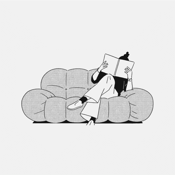
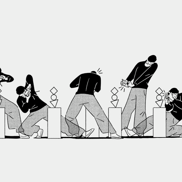
The Illustration pillar at Reaktor embodies our expressive, empathetic, and relatable nature. It plays a crucial role in engaging our audience on a human level, simplifying complex concepts, and enhancing our visual storytelling. This pillar captures the vibrancy of our culture, showcasing our creativity, empathy, and adaptability.
Its versatile nature is perfectly suited to the varied tones and needs of Reaktor. This adaptability makes it an indispensable tool in our visual communication, allowing us to connect more effectively with our diverse audience.

Characteristics
Our commissioned illustrations are specifically designed to enhance the understanding of abstract concepts in materials such as articles, white papers or case studies. Our style is:
- Minimal: Characterized by simplicity, focusing on composition and form with a monochrome color scheme and yellow accents for contrast and emphasis.
- Graphic: Bold visuals with strong lines and high contrast capture attention.
- Textured: Repetitive patterns and shapes, inspired by Reaktor's key monograms, add rhythm and strengthen brand identity.
- Expressive: Beyond clean lines and minimalism, our illustrations are emotionally engaging, conveying the tone and mood suitable for the subject matter, enhancing audience connection.
- Clear & Uncluttered: Straightforward compositions eliminate unnecessary elements, ensuring a direct and clear message.
Color Palette
Our illustrations are themed using our distinct brand palette. However, we tailor the color options available to each illustrator we collaborate with, in accordance with their unique style. This approach not only ensures consistency with our brand identity but also infuses variety and freshness into our content.
Important: Refrain from using white as a background color to prevent an unstructured appearance on our website. Instead, opt for Light Grey (#F2F2F2) as a more structured and visually appealing alternative.
Shape & Texture
Our illustrations integrate Reaktor's monogram shapes, serving three key purposes:
- Textural Appeal: These shapes add a distinctive textural layer to our illustrations, enriching the visual detail.
- Visual Consistency: Their use across our illustrations ensures a unified and identifiable visual language that resonates with our brand’s visual identity.
- Artistic Interpretation: Contrasting with their usual rigid and computer-generated structure, in our illustrations, the monogram shapes can be hand-drawn, imperfect, and more free-form. This interpretation adds a human touch and uniqueness to each piece.
Shape & Texture
This page features a collection of pattern examples, drawing inspiration from Reaktor's monogram shapes. Use patterns to enrich our illustrations with a distinctive visual identity and depth.
Don'ts
When selecting new illustrators to add to our roster, avoiding certain illustration styles is important to maintaining a cohesive voice.
Illustrators: Form Play
We prioritize using illustrations from Form Play as they align closely with the essential qualities we aim to convey in our preferred style. Their artwork is characterized by its minimalism, graphic appeal, textured elements, expressiveness, and uncluttered design, making it an ideal complement to our graphic system.
Form Play has numerous styles, however, the style outlined in this guide is the one we should adhere to.
Website www.formplay.co
Color Palette
This palette is reserved for Form Play's illustration work. The palette is muted in order to maintain a minimal, graphic and focussed aesthetic.
Photography
Overview
Our photography should feel authentic, engaging, and positive—depicting people in their natural environments and working collaboratively. These images are candid and relaxed, never overly staged or posed, and shot in natural light with high contrast whenever possible. Our goal is to feel human, not corporate.
Things we like:
- High brightness and contrast: Lighting and color should be crisp, clear, and vibrant.
- Imperfection: Shots that aren’t overly precious or considered can offer character.
- Motion: Subjects captured mid-gesture add energy, movement, and authenticity to the frame.
- Natural environments: Moments away from the desk or computer capture snippets of the space and evoke it’s personality, but it should not appear too busy or messy.
- Candidness: Subjects unaware of the camera or engaged in a task or conversation with someone out of frame feel more natural and unposed.
Real-world collaboration: Person-to-person interactions capture special human moments that tech does not. Devices take a back seat.
Headshots
Headshots serve as our visual identity in profiles, presentations, our website, and marketing communications. The style of our headshots should display:
Softness: For an approachable, warm feel.
Muted Colors: Lush and saturated, yet understated tones and hues.
Personality: Capturing the character of the person and their unique traits.
Professionalism: Always maintaining a business demeanor, showing our expertise.
Case studies
Ideally, our case study visuals should combine photography (or video) and imagery of the end product (UI images placed in our templates, device not visible). If there’s no end product or suitable photography, we can commission illustrations (see illustration section).
We can source images in two ways:
Client Photography
Clients' photography can be used if it is high enough quality and aligns with our guidelines on lighting and tone.
Stock Photography
Stock imagery can be sourced to hint at a specific industry. It should convey impact and feel more emotional/evocative than traditional tech imagery. We should avoid cliches.
Things we like:
- People using products/tech in action.
- People collaborating or problem-solving.
- Images hinting at our clients’ work out in the world.
- Showcasing what our work enables.
- Added human touch to products/tech.
- Showcasing emotion or the impact of our work on people.
- Images that convey industry in a slightly abstract manner.
Don'ts
This section outlines practices to avoid, ensuring our imagery always aligns with our brand's values and standards.
Infographics Overview
Infographics reflect the rigor and intelligence of our brand. They are clean and simple, but also smart and complex. Small details, large numbers, a strict grid, and bold shapes define the style of our infographics.
Our infographics follow these principles to order to communicate clarity and impact.
- Clear & Simple
- Impactful
- Contrast
- Precise & Detailed
Don'ts
Here we outline practices to avoid, ensuring our infographics always align the principles we've outlined at the start of this section: clear & simple, impactful, high contrast, precise and detailed.
Application
Overview
This section showcases our visual identity across various platforms and mediums, highlighting the adaptability and versatility of our brand's visual language. As you navigate, let it serve as a source of inspiration, showing the potential and breadth of possibilities.